Warm tip: This article is reproduced from serverfault.com, please click
Unexpected css overflow when padding inside 100% height container
发布于 2020-11-30 16:46:33
I'm trying to fit on the screen the full height of areas with sub areas that are scrollable. While this works without padding (to the sub areas) when I add the padding (blue lines) I get the following undesired overflow (red crossings).
I don't understand why this overflow appears since all the areas are scrollable and set to height 100%.
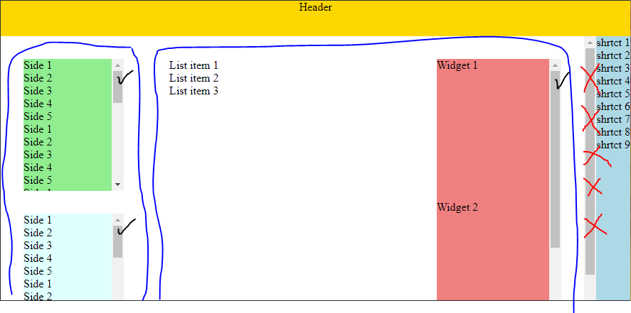
I would like that the content div show no scroll and that side and main are displayed 100% of available height with internal padding.
What I have tried:
- Set padding in the inner elements while this works I would like to avoid it
- Using flex but same issue
- Using margin on the elements but I also would like to avoid it
Is there a way to make it work like that without having to set padding in the inner elements or margin on the outer elements?
---> Fiddle <---
Styles
html, body {
  height: 100%;
  margin: 0;
}
.container {
  display: grid;
  grid-template-areas:
        "a a a"
        "b b c"
        "b b c";
  grid-template-columns: auto auto max-content;
  grid-template-rows: max-content auto;
  height: 100%;
  overflow: auto;
}
.header {
  grid-area: a;
  text-align: center;
  background-color: gold;
  height: 50px;
}
.shortcut {
  grid-area: c;
  background-color: LightBlue;
}

.content {
  grid-area: b;
  display: grid;
  grid-template-columns: 1fr 3fr;
  height: 100%;
  overflow: auto;
}

.side {
  display: grid;
  height: 100%;
  overflow: auto;
  gap: 32px;

  padding: 32px; /* <---- IF I REMOVE PADDING HERE IT WILL WORK AS EXPECTED (EXCEPT I LOOSE THE PADDING) */

  .sub-side {
    display: grid;
    height: 100%;
    overflow: auto;

    &.first {
      background-color: LightGreen;
    }
    &.second {
      background-color: LightCyan;
    }
  }
}

.main {
  display: grid;
  grid-template-columns: 2fr 1fr;
  gap: 24px;
  height: 100%;
  overflow: auto;

  padding: 32px; /* <---- IF I REMOVE PADDING HERE IT WILL WORK AS EXPECTED (EXCEPT I LOOSE THE PADDING) */

  .list {
    height: 100%;
    overflow: auto;
  }

  .widgets {
    display: grid;
    height: 100%;
    overflow: auto;
    background-color: LightCoral;
  }
}

.widgets {
  > div {
    height: 200px;
  }
}
HTML
<div class="container">
  <div class="header"> Header </div>
  <div class="shortcut">
    <div>shrtct 1</div>
    <div>shrtct 2</div>
    <div>shrtct 3</div>
    <div>shrtct 4</div>
    <div>shrtct 5</div>
    <div>shrtct 6</div>
    <div>shrtct 7</div>
    <div>shrtct 8</div>
    <div>shrtct 9</div>
  </div>
  <div class="content">
    <div class="side">
      <div class="sub-side first">
        <div>Side 1</div>
        <div>Side 2</div>
        <div>Side 3</div>
        <div>Side 4</div>
        <div>Side 5</div>
        <div>Side 1</div>
        <div>Side 2</div>
        <div>Side 3</div>
        <div>Side 4</div>
        <div>Side 5</div>
        <div>Side 1</div>
        <div>Side 2</div>
        <div>Side 3</div>
        <div>Side 4</div>
        <div>Side 5</div>
        <div>Side 1</div>
        <div>Side 2</div>
        <div>Side 3</div>
        <div>Side 4</div>
        <div>Side 5</div>
        <div>Side 1</div>
        <div>Side 2</div>
        <div>Side 3</div>
        <div>Side 4</div>
        <div>Side 5</div>
        <div>Side 1</div>
        <div>Side 2</div>
        <div>Side 3</div>
        <div>Side 4</div>
        <div>Side 5</div>
        <div>Side 1</div>
        <div>Side 2</div>
        <div>Side 3</div>
        <div>Side 4</div>
        <div>Side 5</div>
      </div>
      <div class="sub-side second">
        <div>Side 1</div>
        <div>Side 2</div>
        <div>Side 3</div>
        <div>Side 4</div>
        <div>Side 5</div>
        <div>Side 1</div>
        <div>Side 2</div>
        <div>Side 3</div>
        <div>Side 4</div>
        <div>Side 5</div>
        <div>Side 1</div>
        <div>Side 2</div>
        <div>Side 3</div>
        <div>Side 4</div>
        <div>Side 5</div>
        <div>Side 1</div>
        <div>Side 2</div>
        <div>Side 3</div>
        <div>Side 4</div>
        <div>Side 5</div>
        <div>Side 1</div>
        <div>Side 2</div>
        <div>Side 3</div>
        <div>Side 4</div>
        <div>Side 5</div>
        <div>Side 1</div>
        <div>Side 2</div>
        <div>Side 3</div>
        <div>Side 4</div>
        <div>Side 5</div>
        <div>Side 1</div>
        <div>Side 2</div>
        <div>Side 3</div>
        <div>Side 4</div>
        <div>Side 5</div>
      </div>
    </div>
    <div class="main">
      <div class="list">
        <div>List item 1</div>
        <div>List item 2</div>
        <div>List item 3</div>
      </div>
      <div class="widgets">
        <div>
         Widget 1
        </div>
        <div>
         Widget 2
        </div>
        <div>
         Widget 2
        </div>
      </div>
    </div>
  </div>
</div>
Questioner
Arno 2501
Viewed
0

Thanks!!! raah
height: autosimple yet super efficient +1