Warm tip: This article is reproduced from serverfault.com, please click
Having trouble creating left align and right align on the same line in my responsive website
发布于 2020-12-05 01:11:12
I'm trying to place my social medial icons on the bottom left while placing the copyright text on the bottom right in all size of the screen (PC & Mobile).
I have tried with 'float: right' on the CSS for the text, but doesn't seem to work properly.
I have tried changing the parent element as display: flex or display: flexbox, but I'm not sure what I'm doing wrong.
This is what I see and I have marked where I want to place the text:
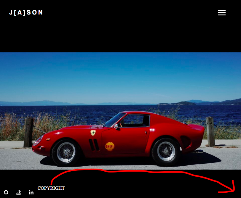
I can move the text with padding-right: 'x'em or px, but I want the text to be at the bottom right edge of page, just like how my social media logo is at the moment.
Here is a quick snippet of the code:
HTML
     <div class ="bottom">
            <div class = "logos">
                <a href="https://github.com/j-ahn94" target="_blank" class="fa fa-github"></a>
                <a href="https://stackoverflow.com/users/14266888/jason-a" target="_blank" class="fa fa-stack-overflow"></a>
                <a href="https://www.linkedin.com/in/jasonja-ahn/" target="_blank" class="fa fa-linkedin"></a>
                <p> COPYRIGHT </p>
            </div>
        </div>
    </div>
CSS
.bottom {
    margin-top: auto;
}

.logos {
    display: flex !important;
    flex-direction: row;
    background-color: black;
    bottom: 0;
    position: fixed;
}

.logos a {
    color: white;
    text-align: center;
    padding: 14px;
    text-decoration: none;
    font-size: 17px;
}
.logos p {
    float: right;
    color: white;
}
Entire HTML:
<!DOCTYPE html>
<html lang="en">
<head>
    <meta charset="UTF-8">
    <meta name="viewport" content="width=device-width, initial-scale=1.0">
    <link rel="stylesheet" href="J.css">
    <link rel="stylesheet" href="https://cdnjs.cloudflare.com/ajax/libs/font-awesome/4.7.0/css/font-awesome.min.css">
    <title>J[a]son</title>
</head>
<body>
    <div class = "overall">
        <nav>
            <div class = "logo">
                <h4><a href="home.html">J[a]son</a></h4>
            </div>
            <ul class = "nav-links">
                <li>
                    <a href="home.html">HOME</a>
                </li>
                <li>
                    <a href="#">PHOTOGRAPHY</a>
                    <ul class="sub-menu">
                        <li><a href="photography_colour.html">Colour</a></li>
                        <li><a href="photography_black.html">Black</a></li>
                    </ul>
                </li>
                <li>
                    <a href="coding.html">CODING</a>
                </li>
                <li>
                    <a href="about.html">ABOUT</a>
                </li>
            </ul>
            <div class= "burger">
                <div class="line1"></div>
                <div class="line2"></div>
                <div class="line3"></div>
            </div>
        </nav>
        <script src="testing.js"></script>
        <div class="main_car_wrapper">
            <img class="main_car" src="Photos/main_car1.jpg" alt="car" width="100%" height="100%"/>

        </div>
            <!--<p>June, 2020. Sunshine Coast, BC, Canada </p>-->
        <div class ="bottom">
            <div class = "logos">
                <a href="https://github.com/j-ahn94" target="_blank" class="fa fa-github"></a>
                <a href="https://stackoverflow.com/users/14266888/jason-a" target="_blank" class="fa fa-stack-overflow"></a>
                <a href="https://www.linkedin.com/in/jasonja-ahn/" target="_blank" class="fa fa-linkedin"></a>
                <p> COPYRIGHT </p>
            </div>
        </div>
    </div>
</body>
</html>
Entire CSS:
html {
    min-height: 100vh;
}

* {
    margin: 0px;
    padding: 0px;
    box-sizing: border-box;
}

body {
    background-color: black !important; /*rgb(241, 233, 233);*/
    display: flex;
    flex-direction: column;
    min-height: 100vh;

}

nav {
    display: flex !important;
    justify-content: space-between;
    padding-right: 2em;
    padding-left: 2em;
    padding-top: 2em;
    padding-bottom: 1.5em;
    align-items: center;
    min-height: 8vh;
    background-color: black;
    /*font-family: 'Gill Sans', 'Gill Sans MT', Calibri, 'Trebuchet MS', sans-serif;*/
    font-family: 'Poppins', sans-serif;
}

.logo {
    background-color: black;
    color: rgb(240, 235, 235);
    font-size: 20px;
    text-transform: uppercase;
    letter-spacing: 5px;
}

.logo a {
    text-decoration: none;
    color: white;
}

.logo_colour {
    background-color: black !important;
    color: rgb(240, 235, 235) !important;
    text-transform: uppercase !important;
    letter-spacing: 5px !important;
}

.logo_colour a {
    text-decoration: none !important;
    color: white !important;
    font-weight: bold !important;
    font-size: 20px !important;
}

.logo_black {
    background-color: black !important;
    color: rgb(240, 235, 235) !important;
    text-transform: uppercase !important;
    letter-spacing: 5px !important;
}

.logo_black a {
    text-decoration: none !important;
    color: white !important;
    font-weight: bold !important;
    font-size: 20px !important;
}

.logo_about {
    background-color: black !important;
    color: rgb(240, 235, 235) !important;
    text-transform: uppercase !important;
    letter-spacing: 5px !important;
}

.logo_about a {
    text-decoration: none !important;
    color: white !important;
    font-weight: bold !important;
    font-size: 20px !important;
}

.nav-links {
    display: flex;
    justify-content: space-around;
    width: 30%;
}

.nav-links li {
    list-style: none;
}

.nav-links a {
    color: white;
    text-decoration: none;
    letter-spacing: 1px;
    font-weight: bold;
    font-size: 11px;
    padding: 5px 5px;
}

.nav-links a:hover {
    text-decoration: none;
    color: white;
}

.burger {
    display: none;
    cursor: pointer;
}

.burger div {
    width: 25px;
    height: 3px;
    background-color: white;
    margin: 5px;
    transition: all 0.3s ease;
}

@media screen and (max-width:1430px) {
    .nav-links {
        width: 40%;
    }
}

@media screen and (max-width:950px) {
    * {
        margin: 0;
        padding: 0;
    }*/

    body, html {
        overflow-x: hidden;
    }

    .nav-links {
        position: absolute;
        right: 0px;
        height: 50vh;
        top: 11vh;
        background-color: black;
        display: flex;
        flex-direction: column;
        align-items: center;
        width: 50%;
        transform: translateX(100%);
        padding-right: 0em;
        transition: transform 0.5s ease-in;
        z-index: 99999 !important;

    }
    .nav-links li {
        opacity: 0;
    }

    .burger {
        display: block;
        padding-right: 1em;
    }
    .sub-menu {
        position: relative;
    }
    .carousel-control-prev {
        padding-top: 5em;
    }

    .carousel-control-next {
        padding-top: 5em;
    }

    .carousel-item {
        padding-top: 6em;
    }

    .logos {
        padding-bottom: 0em;
    }
}

.nav-active {
    transform: translate(0%);https://ahweb.org.uk/car.png
}

.main_car_wrapper {
    background-image: url(https://ahweb.org.uk/car.png);
    background-repeat: no-repeat no-repeat;
    background-position: center center;
    background-size: contain;
    max-width: 100%;
    height: auto;
    padding-top: 6em;
}

@keyframes navLinkFade {
    from {
        opacity: 0;
        transform: translateX(50px);
    }
    to {
        opacity :1;
        transform: translateX(0px);
    }
}

.toggle .line1 {
    transform: rotate(-45deg) translate(-5px, 6px);
}

.toggle .line2 {
    opacity: 0;
}

.toggle .line3 {
    transform: rotate(45deg) translate(-5px, -6px);

}

.sub-menu {
    display: none;
}

.sub-menu li a {
    /*display: block;*/
    text-decoration: none;
    color: white;
    border-top: 1px solid white;
    background: rgb(221, 215, 215);
    white-space: nowrap;
    top: 40px;
    left: 25px;
    padding: 5px;
    padding-top: 1px;
}

.sub-menu li a:hover{
    background: rgb(10, 10, 10);
    opacity: 1;
    transition: all 0.5s ease;
}

li:hover ul {
    display: flex;
    position: absolute;
}

li:hover li {
    float: none;
    font-size: 8px;
}

li:hover a {
    background: rgb(5, 5, 5);
}

li:hover li a:hover {
    background: rgb(19, 18, 18);
}

.bottom {
    margin-top: auto;
}

.logos {
    display: flex !important;
    flex-direction: row;
    background-color: black;
    bottom: 0;
    position: fixed;
}

.logos a {
    color: white;
    text-align: center;
    padding: 14px;
    text-decoration: none;
    font-size: 17px;
}

.logos a:hover {
    text-decoration: none;
    color: white;
}

.logos p {
    float: right;
    color: white;
}

.carousel-inner p {
    text-align: center;
    color: black;
    font-size: 14px;
}

.carousel-inner {
    background-color: black;
}

.carousel-inner img {
    display: flex;
    margin: 0 auto;
    width: 50vw;
    max-height: auto;
    align-items: center;
}

/*.carousel-item {
    height: 300px
}*/

.carousel-control-prev-icon {
    background-image: url("data:image/svg+xml;charset=utf8,%3Csvg xmlns='http://www.w3.org/2000/svg' fill='%23fff' viewBox='0 0 8 8'%3E%3Cpath d='M5.25 0l-4 4 4 4 1.5-1.5-2.5-2.5 2.5-2.5-1.5-1.5z'/%3E%3C/svg%3E");
}

.carousel-control-next-icon {
    background-image: url("data:image/svg+xml;charset=utf8,%3Csvg xmlns='http://www.w3.org/2000/svg' fill='%23fff' viewBox='0 0 8 8'%3E%3Cpath d='M2.75 0l-1.5 1.5 2.5 2.5-2.5 2.5 1.5 1.5 4-4-4-4z'/%3E%3C/svg%3E");
}

.overall {
    overflow: hidden;
    position: relative;
}

/* About section */

.about_title {
    color: rgba(255, 255, 255, 0.671);
    text-decoration: underline;
}

.about_body {
    padding-left: 1.5em;
    padding-right: 1.5em;
    padding-top: 2em;
    display: block;

}

.about_body p {
    color: rgba(255, 255, 255, 0.671);
}

.about_body img {
    padding: 10px;
    max-height: 320px;
    width: 220px;
    float: right;
}
Questioner
Muzzlet
Viewed
0

Thank you so much! It worked! The text seems to be floating a bit at the top from the very bottom. Is there a way I can make this move at the very edge of the bottom page?
No worries. Add height to logos div, eg .logos { height : 20px } and you can add align-item : center; to center it vertical inside the logos div