Warm tip: This article is reproduced from stackoverflow.com, please click
css html

Bootstrap CSS

发布于 2020-03-29 12:46:55

I am busy prototyping a layout using bootstrap and some custom css. I have a div with container-fluid and then two rows. 1st row has three columns within and second row just has a full width div in it.

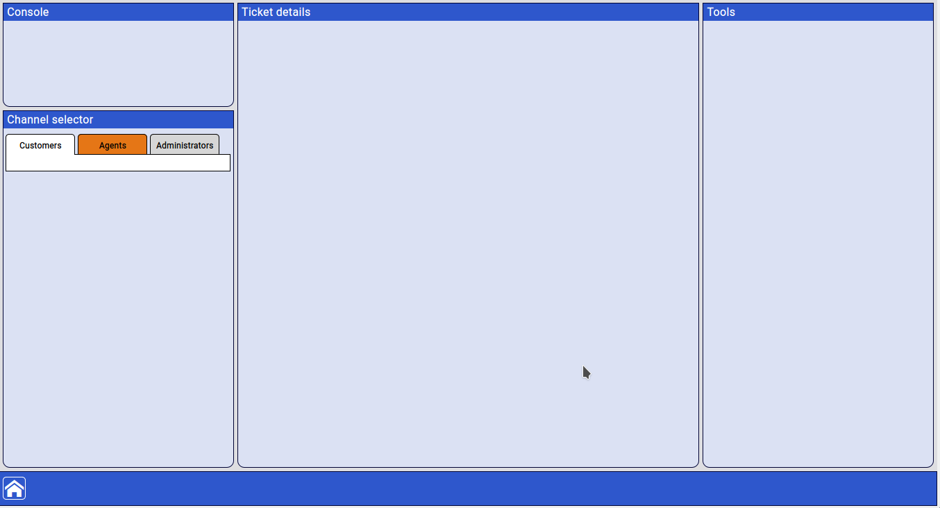
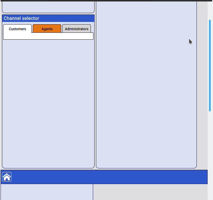
All is good until I reduce the window size and a break-point is reached and the design becomes responsive which is fine other than the second row with the full width div seems to float over the 1st row elements instead of staying at the bottom.

How do I get the 2nd row to stay pinned to the bottom when in a smaller client size.

Note that the 1st row is setup to expand and fill the remaining height of the screen, the 2nd row is a fixed 50px in height.

Bootstrap taken from https://maxcdn.bootstrapcdn.com/bootstrap/4.0.0/

Screen grabs of effect (HTML after)

enter image description here

enter image description here

HTML template

@import url('https://fonts.googleapis.com/css?family=Roboto&display=swap');

html,
body {
    height: 100%;
    margin: 0;
    font-family: 'Roboto', sans-serif;
    background-color: #dedee1;
}

#ctr-main {
    height: 100%;
    min-height: 100%;
    display: flex;
    flex-direction: column;
}

.red-border {
    border: 1px red solid;
}

.blue-border {
    border: 1px blue solid;
}

.panel {
    width: 100%;
    background-color: rgba(218, 226, 254, 0.63);
    margin-top: 5px;
    overflow: hidden;
}

#panel-ticket-tabs {
    height: 50px;
}

#panel-ticket-meta {
    height: 100px;
}

#panel-status {
    height: 150px;
}

#panel-customer-info {
    height: 150px;
}

#panel-customer-history {
    height: 250px;
}

#panel-customer-shortcuts {
    height: 250px;
}

#panel-ticket {
    /*height:500px;*/
    flex-grow: 1;
}

#panel-channels {
    height: 500px;
}

#panel-tools {
    /*flex-grow: 1;*/
}

#panel-bottom-bar {
    width: 100%;
    height: 50px;
    background-color: #2e57cc;
    display: block;
    position: relative;
    text-align: left;
}

.pnl-title {
    width: 100%;
    height: 25px;
    vertical-align: middle;
    color: white;
    font-size: 1em;
    font-weight: bold;
    background-color: #2e57cc;
    overflow: hidden;
    line-height: 25px;
    padding-left: 5px;
    /*! border-bottom: 2px solid #22366f; */
}

.row-flex {
    flex: 1;
}

.column-flex {
    display: flex;
    flex-flow: column;
    height: 100%;
}

.panel-height-filler {
    display: flex;
    flex-flow: column;
    height: 100%;
    flex: 1 1 auto;
}

.pnl-round-corner-bottom {
    border-bottom-left-radius: 10px;
    border-bottom-right-radius: 10px;
}

.pnl-round-corner {
    border-radius: 10px;
}

.pnl-square {
    border-radius: 0;
}

.pnl-border {
    border: 1px solid #000335;
}

.pnlSection {
    background-color: #fff;
    width:98%;
    min-height:25px;
    margin: 0 auto;
    z-index: 20;
}

.pnlSection-border {
    border:1px solid black;
}

#pnlSection-user-tabs {
    background-color: transparent;
    z-index: 25;
}

#pnlSection-channels {
    margin-top: -1px;
}


.tabButton {
    display:inline-block;
    border-radius: 5px 5px 0 0;
    background-color: #d6d6d6;
    height: 30px;
    width: 100px;
    border-top: 1px solid black;
    border-left: 1px solid black;
    border-right: 1px solid black;
    line-height: 30px;
    border-bottom: 1px solid black;
}

.tabButton > span {
    display:block;
    font-weight: bold;
    color:black;
    font-size:12px;
    padding:0;
    margin:auto 0;
    /*! line-height: normal; */
    text-align: center;
}

.tabButton:hover {
    background-color: #ffffff;
    cursor: pointer;
}

#panel-bottom-bar > .icon-container {
    color: white;
    display: inline-block;
    position: relative;
    margin: 7px 0 auto .25em;
    border: white 1px solid;
    padding:2px;
    border-radius: 5px;
    overflow:hidden;
}

#panel-bottom-bar > .icon-container:hover {
    background-color:white;
    color:#2e57cc;
    border-color:#2e57cc;
    cursor:pointer;
}

#panel-bottom-bar > .icon-container.active {
    background-color:white;
    color:#2e57cc;
    border-color:#2e57cc;
}

.activeTab {
    background-color: white;
    border-bottom: 0;
}

.alertTab {
    background-color: #e57616;
}

.pnl-outer-shadow {
    -webkit-box-shadow: 3px 3px 5px 6px #9c9c9c; /* Safari 3-4, iOS 4.0.2 - 4.2, Android 2.3+ */
    -moz-box-shadow: 3px 3px 5px 6px #9c9c9c; /* Firefox 3.5 - 3.6 */
    box-shadow: 3px 3px 5px 6px #9c9c9c; /* Opera 10.5, IE 9, Firefox 4+, Chrome 6+, iOS 5 */
}

.pnl-inner-shadow {
    -moz-box-shadow: inset 0 0 10px #9c9c9c;
    -webkit-box-shadow: inset 0 0 10px #9c9c9c;
    box-shadow: inset 0 0 10px #9c9c9c;
}

.pnl-bend-shadow-bottom {
    -webkit-box-shadow: 0 10px 6px -6px #777;
    -moz-box-shadow: 0 10px 6px -6px #777;
    box-shadow: 0 10px 6px -6px #777;
}

#ctr-main > div.container-fluid {
    padding-left: 15px;
    padding-right: 15px;
}

#column-left > div.row {
    margin: 0 0 0 2px;
}

#column-middle > div.row {
    margin: 0 2px 0 2px;
}

#column-right > div.row {
    margin: 0 2px 0 0;
}

#column-left {
    /*! vertical-align: top; */
    /*! margin: auto; */
    margin-top: 0;
    padding-left: 5px;
}

#column-right {
    padding-right: 5px;
}

#column-middle {
    padding-left: 5px;
    padding-right: 5px;
}
<!DOCTYPE html>
<html>
<head>
    <meta charset="utf-8">
    <meta name="viewport" content="width=device-width, initial-scale=1, shrink-to-fit=no">
    <title>Prototype1 - Main</title>
    <!-- Styles and links to JS removed for clarity -->
</head>

<body>

<div id="ctr-main" class="container-fluid">
    <div class="row row-flex">
        <div class="col-sm-3 column-flex" id="column-left">
            <div id="panel-status" class="panel pnl-round-corner-bottom pnl-border">
                <h2 class="pnl-title">Console</h2>
            </div>
            <div id="panel-channels" class="panel panel-height-filler pnl-round-corner-bottom pnl-border">
                <h2 class="pnl-title">Channel selector</h2>
                <div id="pnlSection-user-tabs" class="pnlSection">
                    <div class="tabButton activeTab"><span>Customers</span></div>
                    <div class="tabButton alertTab"><span>Agents</span></div>
                    <div class="tabButton"><span>Administrators</span></div>
                </div>
                <div id="pnlSection-channels" class="pnlSection pnlSection-border">

                </div>
            </div>
        </div>
        <div class="col-sm-6 column-flex" id="column-middle">
            <div id="panel-ticket" class="panel panel-height-filler pnl-round-corner-bottom pnl-border">
                <h2 class="pnl-title">Ticket details</h2>
            </div>
        </div>
        <div class="col-sm-3 column-flex" id="column-right">
            <div id="panel-tools" class="panel panel-height-filler pnl-round-corner-bottom pnl-border">
                <h2 class="pnl-title">Tools</h2>
            </div>
        </div>
    </div>
    <div class="row">
        <div id="panel-bottom-bar" class="panel pnl-square pnl-border">
            <div class="icon-container">
                <span class="icon-home"></span>
            </div>
        </div>
    </div>
</div>

</body>

</html>
Questioner
John Cogan
Viewed
22
Mihai T 2020-01-31 17:17

Height 100% on column-flex won't work here. 100% of what ? that's the problem. You should use auto so it takes the height of it's content because you set fixed heights on the panels .

You should add this in a media query. See code below or -> JsFiddle

html,
body {
    height: 100%;
    margin: 0;
    font-family: 'Roboto', sans-serif;
    background-color: #dedee1;
}

#ctr-main {
    height: 100%;
    min-height: 100%;
    display: flex;
    flex-direction: column;
}

.red-border {
    border: 1px red solid;
}

.blue-border {
    border: 1px blue solid;
}

.panel {
    width: 100%;
    background-color: rgba(218, 226, 254, 0.63);
    margin-top: 5px;
    overflow: hidden;
}

#panel-ticket-tabs {
    height: 50px;
}

#panel-ticket-meta {
    height: 100px;
}

#panel-status {
    height: 150px;
}

#panel-customer-info {
    height: 150px;
}

#panel-customer-history {
    height: 250px;
}

#panel-customer-shortcuts {
    height: 250px;
}

#panel-ticket {
    /*height:500px;*/
    flex-grow: 1;
}

#panel-channels {
    height: 500px;
}

#panel-tools {
    /*flex-grow: 1;*/
}

#panel-bottom-bar {
    width: 100%;
    height: 50px;
    background-color: #2e57cc;
    display: block;
    position: relative;
    text-align: left;
}

.pnl-title {
    width: 100%;
    height: 25px;
    vertical-align: middle;
    color: white;
    font-size: 1em;
    font-weight: bold;
    background-color: #2e57cc;
    overflow: hidden;
    line-height: 25px;
    padding-left: 5px;
    /*! border-bottom: 2px solid #22366f; */
}

.row-flex {
    flex: 1;
}

.column-flex {
    display: flex;
    flex-flow: column;
    height:100%
}

.panel-height-filler {
    display: flex;
    flex-flow: column;
    height: 100%;
    flex: 1 1 auto;
}

.pnl-round-corner-bottom {
    border-bottom-left-radius: 10px;
    border-bottom-right-radius: 10px;
}

.pnl-round-corner {
    border-radius: 10px;
}

.pnl-square {
    border-radius: 0;
}

.pnl-border {
    border: 1px solid #000335;
}

.pnlSection {
    background-color: #fff;
    width:98%;
    min-height:25px;
    margin: 0 auto;
    z-index: 20;
}

.pnlSection-border {
    border:1px solid black;
}

#pnlSection-user-tabs {
    background-color: transparent;
    z-index: 25;
}

#pnlSection-channels {
    margin-top: -1px;
}


.tabButton {
    display:inline-block;
    border-radius: 5px 5px 0 0;
    background-color: #d6d6d6;
    height: 30px;
    width: 100px;
    border-top: 1px solid black;
    border-left: 1px solid black;
    border-right: 1px solid black;
    line-height: 30px;
    border-bottom: 1px solid black;
}

.tabButton > span {
    display:block;
    font-weight: bold;
    color:black;
    font-size:12px;
    padding:0;
    margin:auto 0;
    /*! line-height: normal; */
    text-align: center;
}

.tabButton:hover {
    background-color: #ffffff;
    cursor: pointer;
}

#panel-bottom-bar > .icon-container {
    color: white;
    display: inline-block;
    position: relative;
    margin: 7px 0 auto .25em;
    border: white 1px solid;
    padding:2px;
    border-radius: 5px;
    overflow:hidden;
}

#panel-bottom-bar > .icon-container:hover {
    background-color:white;
    color:#2e57cc;
    border-color:#2e57cc;
    cursor:pointer;
}

#panel-bottom-bar > .icon-container.active {
    background-color:white;
    color:#2e57cc;
    border-color:#2e57cc;
}

.activeTab {
    background-color: white;
    border-bottom: 0;
}

.alertTab {
    background-color: #e57616;
}

.pnl-outer-shadow {
    -webkit-box-shadow: 3px 3px 5px 6px #9c9c9c; /* Safari 3-4, iOS 4.0.2 - 4.2, Android 2.3+ */
    -moz-box-shadow: 3px 3px 5px 6px #9c9c9c; /* Firefox 3.5 - 3.6 */
    box-shadow: 3px 3px 5px 6px #9c9c9c; /* Opera 10.5, IE 9, Firefox 4+, Chrome 6+, iOS 5 */
}

.pnl-inner-shadow {
    -moz-box-shadow: inset 0 0 10px #9c9c9c;
    -webkit-box-shadow: inset 0 0 10px #9c9c9c;
    box-shadow: inset 0 0 10px #9c9c9c;
}

.pnl-bend-shadow-bottom {
    -webkit-box-shadow: 0 10px 6px -6px #777;
    -moz-box-shadow: 0 10px 6px -6px #777;
    box-shadow: 0 10px 6px -6px #777;
}

#ctr-main > div.container-fluid {
    padding-left: 15px;
    padding-right: 15px;
}

#column-left > div.row {
    margin: 0 0 0 2px;
}

#column-middle > div.row {
    margin: 0 2px 0 2px;
}

#column-right > div.row {
    margin: 0 2px 0 0;
}

#column-left {
    /*! vertical-align: top; */
    /*! margin: auto; */
    margin-top: 0;
    padding-left: 5px;
}

#column-right {
    padding-right: 5px;
}

#column-middle {
    padding-left: 5px;
    padding-right: 5px;
}
/* add breakpoint */
@media only screen(max-width:550px) {
  .column-flex {
    height:auto;
    min-height:100vh;
  }
}
<link href="https://maxcdn.bootstrapcdn.com/bootstrap/4.0.0-alpha.2/css/bootstrap.min.css" rel="stylesheet"/>
<div id="ctr-main" class="container-fluid">
    <div class="row row-flex">
        <div class="col-sm-3 column-flex" id="column-left">
            <div id="panel-status" class="panel pnl-round-corner-bottom pnl-border">
                <h2 class="pnl-title">Console</h2>
            </div>
            <div id="panel-channels" class="panel panel-height-filler pnl-round-corner-bottom pnl-border">
                <h2 class="pnl-title">Channel selector</h2>
                <div id="pnlSection-user-tabs" class="pnlSection">
                    <div class="tabButton activeTab"><span>Customers</span></div>
                    <div class="tabButton alertTab"><span>Agents</span></div>
                    <div class="tabButton"><span>Administrators</span></div>
                </div>
                <div id="pnlSection-channels" class="pnlSection pnlSection-border">

                </div>
            </div>
        </div>
        <div class="col-sm-6 column-flex" id="column-middle">
            <div id="panel-ticket" class="panel panel-height-filler pnl-round-corner-bottom pnl-border">
                <h2 class="pnl-title">Ticket details</h2>
            </div>
        </div>
        <div class="col-sm-3 column-flex" id="column-right">
            <div id="panel-tools" class="panel panel-height-filler pnl-round-corner-bottom pnl-border">
                <h2 class="pnl-title">Tools</h2>
            </div>
        </div>
    </div>
    <div class="row">
        <div id="panel-bottom-bar" class="panel pnl-square pnl-border">
            <div class="icon-container">
                <span class="icon-home"></span>
            </div>
        </div>
    </div>
</div>