Warm tip: This article is reproduced from stackoverflow.com, please click
How to match width of text to width of dynamically sized image?
发布于 2020-03-30 21:15:16
Please see this codepen: https://codepen.io/allen-houng/pen/XGMjMr?editors=1100#0
<div>
<img src="https://res.cloudinary.com/djcpf0lmv/image/upload/v1549372650/Templates/yoga.jpg" data-radium="true" style=";">
<div class="description">
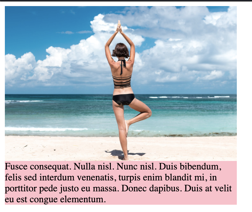
Fusce consequat. Nulla nisl. Nunc nisl. Duis bibendum, felis sed interdum venenatis, turpis enim blandit mi, in porttitor pede justo eu massa. Donec dapibus. Duis at velit eu est congue elementum.
</div>
</div>
I have a parent div with two child divs - an image and a description. I'm sizing the image according to viewport height which means the width would be dynamic and responsive. How would I size the corresponding sibling div .description to match the image's width without javascript?
In other words, how do I turn this:
into this:
Questioner
Allen
Viewed
18
