Warm tip: This article is reproduced from stackoverflow.com, please click
More than 4 images below the main image in Shopify
发布于 2020-04-21 11:22:36
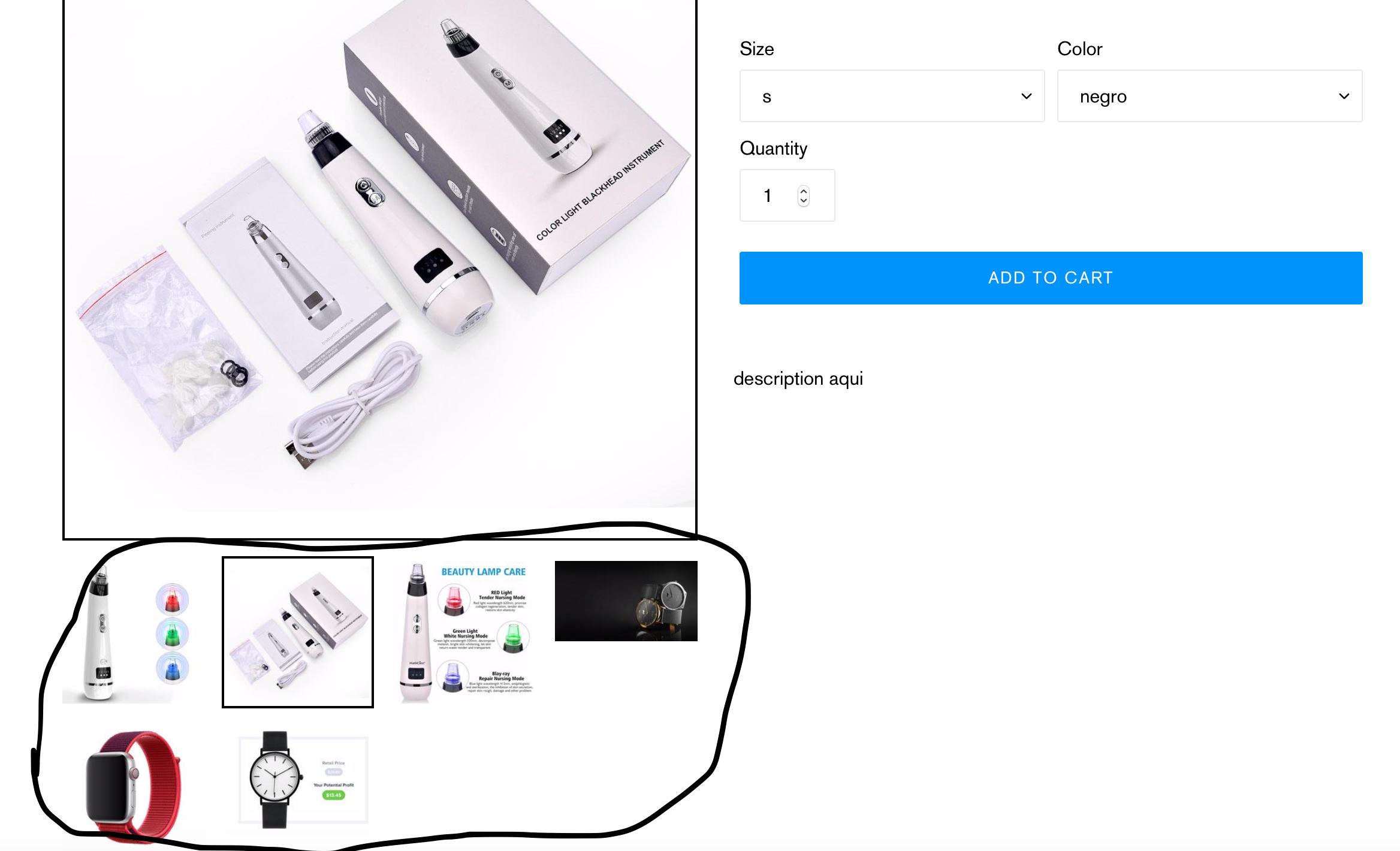
I am using the Debut theme and I would like to know how can I have more than 4 images below the main image.
The image below is for example only.
Questioner
Adalid Bori Palma
Viewed
42
