Warm tip: This article is reproduced from stackoverflow.com, please click
css media-queries tailwind-css

Why @screen xl and @screen lg gets overridden by @screen md in tailwindcss?

发布于 2020-03-27 15:40:41

I extended tailwind margin properties in the config file:

module.exports = {
    theme: {
        extend: {
            'margin': {
                '1/5': '20%',
                '1/4': '25%',
                '1/3': '33.333333%'
            }
        }
    },
    variants: {
        margin: ['responsive']
    },
    plugins: []
}

And then applied it in my css with the following:
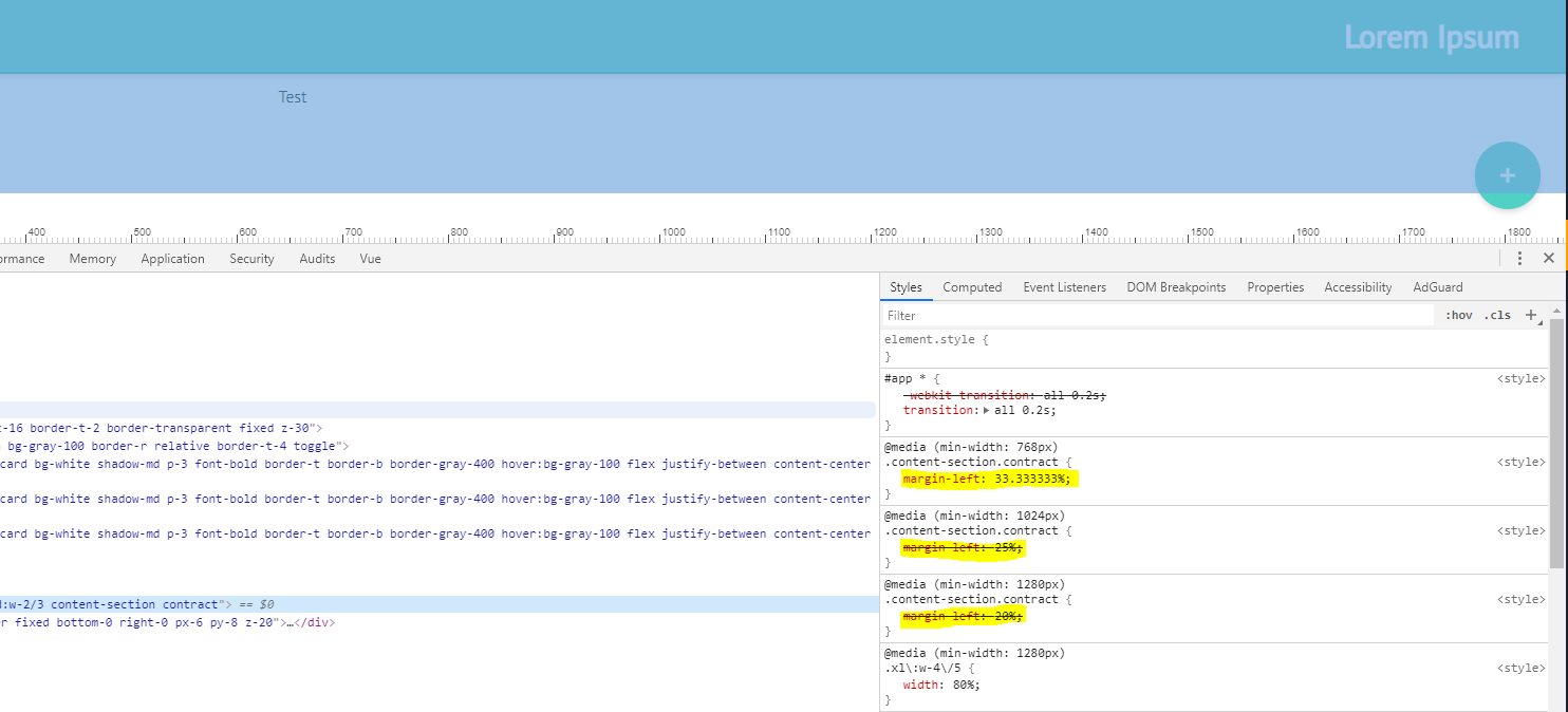
@screen xl {
    .content-section.contract {
        @apply ml-1/5;
    }
}

@screen lg {
    .content-section.contract {
        @apply ml-1/4;
    }
}

@screen md {
    .content-section.contract {
        @apply ml-1/3;
    }
}

But instead of getting the margin-left: 20% on extra large screens and margin-left: 25% on large screens, styles gets overridden by the value for medium screens.

enter image description here

I tried adding !important in each styles in different screen sizes but it doesn't work as I expected. I believe this cannot be reproduce in a fiddle, since customize utilities is not supported in CDN version of tailwindcss.

Questioner
threeFatCat
Viewed
54
1,907 2020-02-11 21:16

According to the image, the order of the queries is responsible for this behavior.

This is because whenever multiple css rule of the same priority apply to an element the last one wins.

In this case here: whenever a screen size reaches the width required by the xl query, the queries for the smaller screens apply as well. Since the medium query is the last one, it overrides the styles of the queries that have been declared before.

A rule of thumb is to sort the queries from smallest to largest when using min-width (mobile first). When using max-width (desktop first), it is the other way round.

The solution here is to either use max-width instead of min-width or change the order of your queries, so the smallest screen comes first and the largest last.

Example (reversed order):

@screen md {
    .content-section.contract {
        @apply ml-1/3;
    }
}

@screen lg {
    .content-section.contract {
        @apply ml-1/4;
    }
}

@screen xl {
    .content-section.contract {
        @apply ml-1/5;
    }
}