我有一个固定的前三列的表。我的前三列是固定的。我想的是,其余的列应计算它们的height
和width
自动的基础上,他们的内容。
所以我的CSS看起来像这样:
.outer {
position:relative;
background-color: hotpink;
}
.inner {
overflow-x:scroll;
overflow-y: visible;
width: calc(100% - 1500px);
margin-left: 18em;
background-color: greenyellow;
}
table {
table-layout: fixed;
width: 100%;
}
td, th {
vertical-align: top;
border-top: 1px solid #ccc;
padding: 0.8em;
width: 150px;
height: 42px;
word-break: break-all;
}
.col1 {
position:absolute;
left: 0em;
width: 6em;
}
.col2 {
position:absolute;
left: 6em;
width: 6em;
}
.col3 {
position:absolute;
left: 12em;
width: 6em;
}
.emptyrow {
position:absolute;
left: 0em;
width: 18em;
}
这是表的HTML:
<div class="outer">
<div class="inner">
<table>
<thead>
<tr>
<th class="col1">Header 1</th>
<th class="col2">Header 2</th>
<th class="col3">Header 3</th>
<th>Header 4</th>
<th>Header 5</th>
<th>Header 6</th>
<th>Header 7</th>
</tr>
</thead>
<tbody>
<tr>
<td class="emptyrow">This column should have value.</td>
<td></td>
<td></td>
<td></td>
<td></td>
</tr>
<tr>
<td class="col1">col 1 - B</td>
<td class="col2">col 2 - B</td>
<td class="col3">col 3 - B</td>
<td>col 4 - B</td>
<td>col 5 - B</td>
<td>col 6 - B</td>
<td>col 7 - B</td>
</tr>
<tr>
<td class="col1">col 1 - C</td>
<td class="col2">col 2 - C</td>
<td class="col3">col 3 - C</td>
<td>col 4 - C</td>
<td>col 5 - C</td>
<td>col 6 - C</td>
<td>col 7 - C</td>
</tr>
</tbody>
</table>
</div>
</div>
是否有可能避免设置宽度和高度td
,th
?
我的意思是避免这样的height
和的硬编码值width
:
td, th {
...
width:6em;
height: 4em;
}
是否可以仅使用不带JavaScript的普通CSS?如果无法使用此解决方案实现,那么非常高兴看到另一种方法。
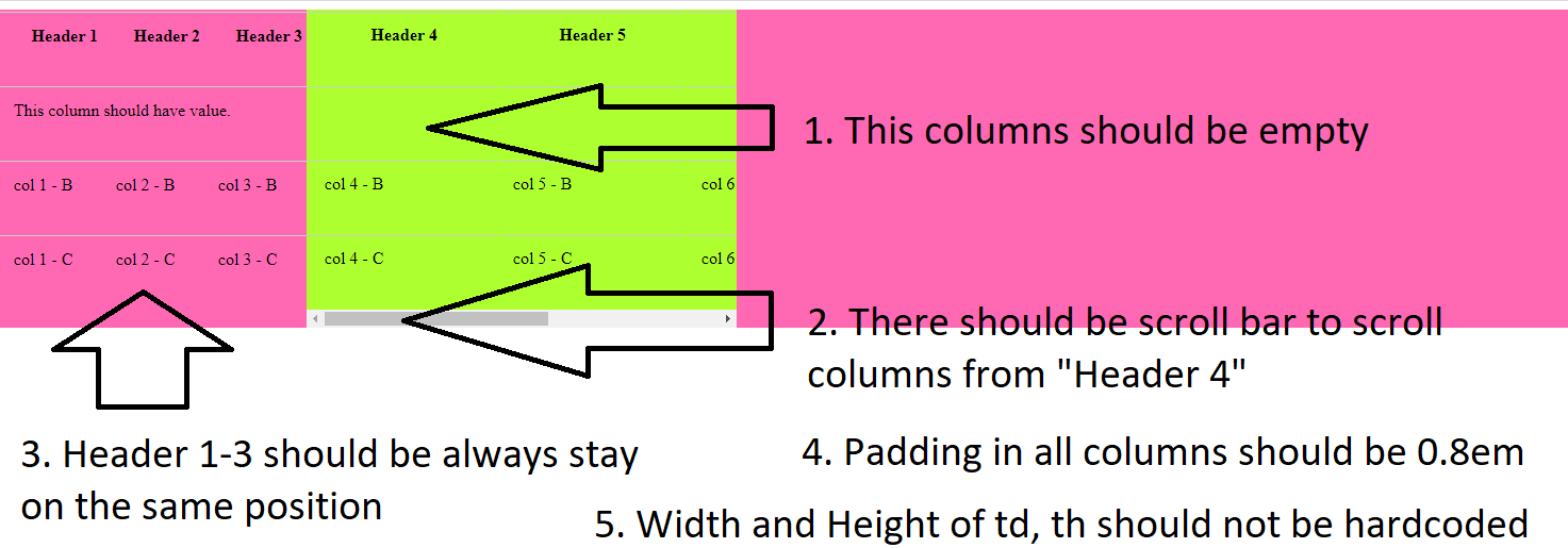
要求:
Padding
所有列中的 0.8em
Width
和Height
的td
,th
不应该被硬编码。它们应该适合内容。border-top: 1px solid #ccc;
此属性应保留恐怕没有完美的解决方案。
我会给您不同的选择,您需要决定放弃什么。
CSS纯CSS-✅旧浏览器-width宽度灵活-highlight正确的突出显示
关键是为width
前三列设置一个固定值,然后将元素的margin-left
属性设置为.wrapped
等于列的总宽度。
.wrapper {
overflow-x: scroll;
overflow-y: visible;
margin-left: 18em;
width: 15em;
background-color: greenyellow;
}
td,
th {
vertical-align: top;
border-top: 1px solid #ccc;
padding: 0.8em;
}
th, tr:nth-of-type(1) td {
height: 1em;
}
th:nth-of-type(1),
td:nth-of-type(1) {
position: absolute;
left: 0em;
width: 6em;
}
th:nth-of-type(2),
td:nth-of-type(2) {
position: absolute;
left: 6em;
width: 6em;
}
th:nth-of-type(3),
td:nth-of-type(3) {
position: absolute;
left: 12em;
width: 6em;
}
tr:hover td {
background-color: yellow;
}
<div class="wrapper">
<table>
<thead>
<tr>
<th>Header-1</th>
<th>Header-2</th>
<th>Header-3</th>
<th>Header-4</th>
<th>Header-5</th>
<th>Header-5</th>
</tr>
</thead>
<tbody>
<tr>
<td></td>
<td></td>
<td></td>
<td></td>
<td></td>
<td></td>
</tr>
<tr>
<td>col 1 - A</td>
<td>col 2 - A</td>
<td>col 3 - A</td>
<td>col 4 - A (WITH LONGER CONTENT)</td>
<td>col 5 - A</td>
<td>col 6 - A</td>
</tr>
<tr>
<td>col 1 - B</td>
<td>col 2 - B</td>
<td>col 3 - B</td>
<td>col 4 - B</td>
<td>col 5 - B</td>
<td>col 6 - B</td>
</tr>
<tr>
<td>col 1 - C</td>
<td>col 2 - C</td>
<td>col 3 - C</td>
<td>col 4 - C</td>
<td>col 5 - C</td>
<td>col 6 - C (WITH_A_LONG_WORD)</td>
</tr>
</tbody>
</table>
CSS纯CSS-✅旧浏览器-width宽度灵活-highlight正确的突出显示
在这里,width
我们不用JS预先对列进行硬编码,而是使用JS来计算和设置width
。
更好的JS实现是可能的。以它为例。
let wrapper = document.querySelector('.wrapper');
let cols = document.querySelectorAll('th');
let widthCol0 = cols[0].offsetWidth;
let widthCol1 = cols[1].offsetWidth;
let widthCol2 = cols[2].offsetWidth;
stylesheet = document.styleSheets[0]
stylesheet.insertRule('th:nth-of-type(1), td:nth-of-type(1) { left: 0px; position: absolute; width: ' + widthCol0 + 'px;}', 0);
stylesheet.insertRule('th:nth-of-type(2), td:nth-of-type(2) { left: ' + widthCol0 + 'px; position: absolute; width: ' + widthCol1 + 'px;}', 0);
stylesheet.insertRule('th:nth-of-type(3), td:nth-of-type(3) { left: ' + (widthCol0 + widthCol1) + 'px; position: absolute; width: ' + widthCol2 + 'px;}', 0);
wrapper.style.marginLeft = (widthCol0 + widthCol1 + widthCol2) + 'px';
.wrapper {
overflow-x: scroll;
overflow-y: visible;
width: 15em;
background-color: greenyellow;
}
td,
th {
vertical-align: top;
border-top: 1px solid #ccc;
padding: 0.8em;
}
th, tr:nth-of-type(1) td {
height: 1em;
}
tr:hover td {
background-color: yellow;
}
<div class="wrapper">
<table>
<thead>
<tr>
<th>Header-1</th>
<th>Header-2</th>
<th>Header-3</th>
<th>Header-4</th>
<th>Header-5</th>
<th>Header-5</th>
</tr>
</thead>
<tbody>
<tr>
<td></td>
<td></td>
<td></td>
<td></td>
<td></td>
<td></td>
</tr>
<tr>
<td>col 1 - A (WITH LONGER CONTENT)</td>
<td>col 2 - A</td>
<td>col 3 - A</td>
<td>col 4 - A (WITH LONGER CONTENT)</td>
<td>col 5 - A</td>
<td>col 6 - A</td>
</tr>
<tr>
<td>col 1 - B</td>
<td>col 2 - B</td>
<td>col 3 - B</td>
<td>col 4 - B</td>
<td>col 5 - B</td>
<td>col 6 - B</td>
</tr>
<tr>
<td>col 1 - C</td>
<td>col 2 - C (WITH_A_LONG_WORD)</td>
<td>col 3 - C</td>
<td>col 4 - C</td>
<td>col 5 - C</td>
<td>col 6 - C (WITH_A_LONG_WORD)</td>
</tr>
</tbody>
</table>
CSS纯CSS-❌旧浏览器-width宽度灵活-highlight正确的突出显示
我真的很喜欢position: sticky
@Dominic显示的解决方案。如果您不需要支持IE,这就是方法。
放弃IE支持将获得回报。您可以使用适当的突出显示,并且前三列的宽度将适应内容。
尽管如此,即使您不需要对a进行硬编码width
,也需要对left
属性进行硬编码以设置列在何时变为粘性。这种挫败了具有灵活性的观点width
。没有办法。
.wrapper {
width: 40em;
overflow-x: scroll;
}
td,
th {
vertical-align: top;
border-top: 1px solid #ccc;
padding: 0.8em;
}
th,
tr:nth-of-type(1) td {
height: 1em;
}
th:nth-of-type(1), td:nth-of-type(1),
th:nth-of-type(2), td:nth-of-type(2),
th:nth-of-type(3), td:nth-of-type(3) {
background-color: white;
position: sticky;
}
th:nth-of-type(1), td:nth-of-type(1) {
left: 0em;
}
th:nth-of-type(2), td:nth-of-type(2) {
left: 6em;
}
th:nth-of-type(3), td:nth-of-type(3) {
left: 12em;
}
tr:hover td{
background-color: yellow;
}
<div class="wrapper">
<table>
<thead>
<tr>
<th>Header-1</th>
<th>Header-2</th>
<th>Header-3</th>
<th>Header-4</th>
<th>Header-5</th>
<th>Header-6</th>
</tr>
</thead>
<tbody>
<tr>
<td></td>
<td></td>
<td></td>
<td></td>
<td></td>
<td></td>
</tr>
<tr>
<td>col 1 - A (WITH LONGER CONTENT)</td>
<td>col 2 - A</td>
<td>col 3 - A</td>
<td>col 4 - A (WITH LONGER CONTENT)</td>
<td>col 5 - A</td>
<td>col 6 - A</td>
</tr>
<tr>
<td>col 1 - B</td>
<td>col 2 - B</td>
<td>col 3 - B</td>
<td>col 4 - B</td>
<td>col 5 - B</td>
<td>col 6 - B</td>
</tr>
<tr>
<td>col 1 - C</td>
<td>col 2 - C (WITH_A_LONG_WORD)</td>
<td>col 3 - C</td>
<td>col 4 - C</td>
<td>col 5 - C</td>
<td>col 6 - C (WITH_A_LONG_WORD)</td>
</tr>
</tbody>
</table>
</div>
CSS纯CSS-❌旧浏览器-width宽度灵活-highlight正确的突出显示
此示例具有与上述示例完全相同的HTML和CSS。
像在第二个示例中一样,我们使用JS计算width
列的。在这种情况下,我们使用它来覆盖left
属性。而且,JS代码更直接。
left
如果以后要使用JS 设置属性,为什么要在CSS中设置该属性?因为如果客户端不运行JS,我们不希望这些列完全折叠,从而破坏我们的布局。
let cols = document.querySelectorAll('th');
let widthCol0 = cols[0].offsetWidth;
let widthCol1 = cols[1].offsetWidth;
stylesheet = document.styleSheets[0];
stylesheet.insertRule('th:nth-of-type(2), td:nth-of-type(2) { left: ' + widthCol0 + 'px !important;}', 0);
stylesheet.insertRule('th:nth-of-type(3), td:nth-of-type(3) { left: ' + (widthCol0 + widthCol1) + 'px !important;', 0);
.wrapper {
width: 40em;
overflow-x: scroll;
}
td,
th {
vertical-align: top;
border-top: 1px solid #ccc;
padding: 0.8em;
}
th,
tr:nth-of-type(1) td {
height: 1em;
}
th:nth-of-type(1), td:nth-of-type(1),
th:nth-of-type(2), td:nth-of-type(2),
th:nth-of-type(3), td:nth-of-type(3) {
background-color: white;
position: sticky;
}
th:nth-of-type(1), td:nth-of-type(1) {
left: 0em;
}
th:nth-of-type(2), td:nth-of-type(2) {
left: 6em;
}
th:nth-of-type(3), td:nth-of-type(3) {
left: 12em;
}
tr:hover td{
background-color: yellow;
}
<div class="wrapper">
<table>
<thead>
<tr>
<th>Header-1</th>
<th>Header-2</th>
<th>Header-3</th>
<th>Header-4</th>
<th>Header-5</th>
<th>Header-6</th>
</tr>
</thead>
<tbody>
<tr>
<td></td>
<td></td>
<td></td>
<td></td>
<td></td>
<td></td>
</tr>
<tr>
<td>col 1 - A (WITH LONGER CONTENT)</td>
<td>col 2 - A</td>
<td>col 3 - A</td>
<td>col 4 - A (WITH LONGER CONTENT)</td>
<td>col 5 - A</td>
<td>col 6 - A</td>
</tr>
<tr>
<td>col 1 - B</td>
<td>col 2 - B</td>
<td>col 3 - B</td>
<td>col 4 - B</td>
<td>col 5 - B</td>
<td>col 6 - B</td>
</tr>
<tr>
<td>col 1 - C</td>
<td>col 2 - C (WITH_A_LONG_WORD)</td>
<td>col 3 - C</td>
<td>col 4 - C</td>
<td>col 5 - C</td>
<td>col 6 - C (WITH_A_LONG_WORD)</td>
</tr>
</tbody>
</table>
</div>
由您决定哪种方法最适合您的需求。
我个人认为,第四名最强大是因为:
如果禁用了JS,则列将崩溃,超出最佳点,但一切将正常进行。只需left
在CSS中使用默认属性即可。
在IE11下,该表将很好地回落到非固定列表。
我认为这没什么大不了的。当然,您正在为IE11是首选浏览器的Intranet编程,采用第一种或第二种方法。
好的非常感谢!真的很棒!拥有一个解决方案真是太好了
position: absolute
。您可以添加一个类来突出显示悬停的行吗?大卫,我只有一个问题。当我突出显示行时,带有的某些列会以
position: absolute
可滚动的列不同地突出显示。是否可以解决此问题?戴维(David)我只是想知道是否可以制作前三列
position: absolute
,但不设置硬编码width
?关于突出显示,这是固定列的已知问题,也是我为什么使用它
tr:hover td {...}
而不是更直截了当的原因tr:hover {...}
。关于position: absolute
不加编码,width
恐怕是不可能的。无论如何,现在我在奔跑,当我回来时让我看看这两件事。@Learner-谢谢您的留言。也祝你今天开心!