Warm tip: This article is reproduced from stackoverflow.com, please click
css html html-table css-position absolute

Table with fixed position of columns without setting height and width of td and th

发布于 2020-03-30 21:13:50

I have a table with fixed first three columns. My first three columns are fixed. What I want is that the rest columns should calculate their height and width automatically, based on their content.

So my CSS looks like this:

.outer {
    position:relative;
    background-color: hotpink;
}
.inner {
    overflow-x:scroll;
    overflow-y: visible;
    width: calc(100% - 1500px);
    margin-left: 18em;
    background-color: greenyellow;
}

table {
    table-layout: fixed;
    width: 100%;
}

td, th {
    vertical-align: top;
    border-top: 1px solid #ccc;
    padding: 0.8em;
    width: 150px;
    height: 42px;
    word-break: break-all;
}

.col1 {
    position:absolute;
    left: 0em;
    width: 6em;
}

.col2 {
    position:absolute;
    left: 6em;
    width: 6em;
 }

.col3 {
    position:absolute;
    left: 12em;
    width: 6em;
}

.emptyrow {
    position:absolute;
    left: 0em;
    width: 18em;
}

This is HTML of table:

<div class="outer">
    <div class="inner">
      <table>
        <thead>
          <tr>
            <th class="col1">Header 1</th>
            <th class="col2">Header 2</th>
            <th class="col3">Header 3</th>
            <th>Header 4</th>
            <th>Header 5</th>
            <th>Header 6</th>
            <th>Header 7</th>
          </tr>
        </thead>
        <tbody>
          <tr>
            <td class="emptyrow">This column should have value.</td>
            <td></td>
            <td></td>
            <td></td>
            <td></td>
          </tr>
          <tr>
            <td class="col1">col 1 - B</td>
            <td class="col2">col 2 - B</td>
            <td class="col3">col 3 - B</td>
            <td>col 4 - B</td>
            <td>col 5 - B</td>
            <td>col 6 - B</td>
            <td>col 7 - B</td>

          </tr>
          <tr>
            <td class="col1">col 1 - C</td>
            <td class="col2">col 2 - C</td>
            <td class="col3">col 3 - C</td>
            <td>col 4 - C</td>
            <td>col 5 - C</td>
            <td>col 6 - C</td>
            <td>col 7 - C</td>
          </tr>
        </tbody>
      </table>
    </div>
  </div>

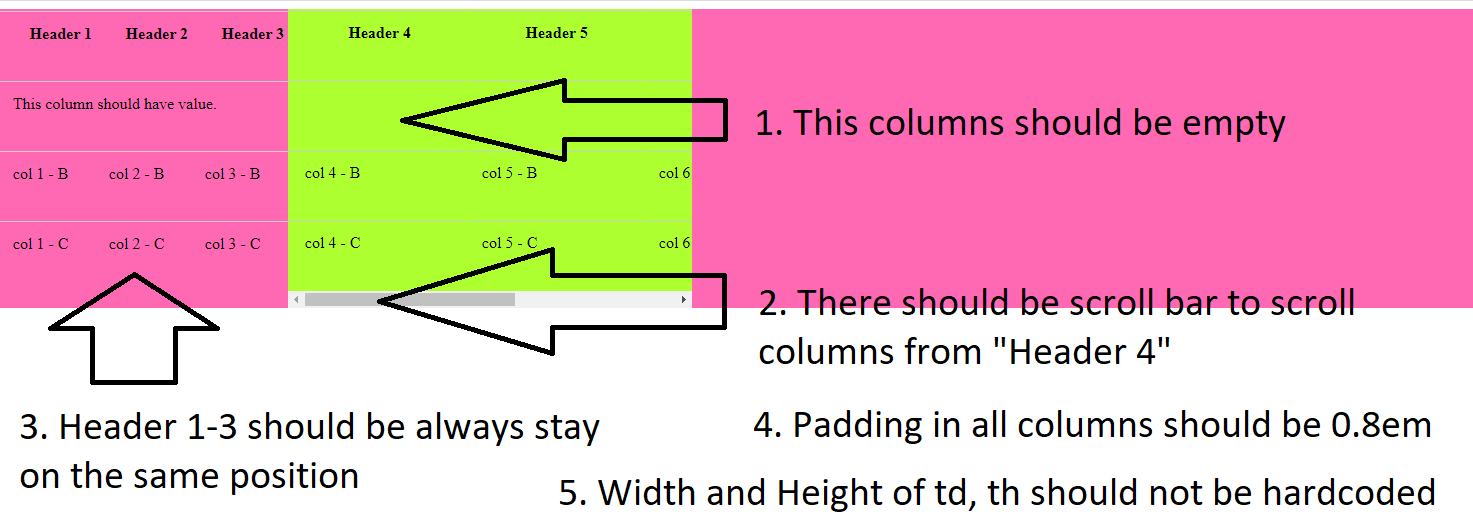
Is it possible to avoid setting width and height in td, th?

I mean to avoid this hardcoded values of height and width:

td, th {
  ...
  width:6em;
  height: 4em;
}

Is it possible to do just with plain CSS without JavaScript? If it is not possible to implement with this solution, it would be really great to see another approach.

Requirements:

  1. Some scrolled columns can be empty
  2. There should be scroll bar to scroll columns from "Header 4"
  3. Header 1-3 should be always stay on the same position
  4. Padding in all columns should be 0.8em
  5. Width and Height of td, th should not be hardcoded. They should fit to content.
  6. border-top: 1px solid #ccc; this property should be kept
  7. Highlighting of hovered row

An image of what it is desirable to see: enter image description here

Questioner
Learner
Viewed
20
David 2020-02-03 23:18

I'm afraid that there isn't any perfect solution.

I will give you different options and you need to decide what to give up.


Absolutely positioned columns.

✅ Pure CSS - ✅ Old browsers - ❌ Flexible width - ❌ Proper highlight

The key is to set a fixed width for the first three columns and then set a margin-left property of the .wrapped element equal to the total width of the columns.

.wrapper {
  overflow-x: scroll;
  overflow-y: visible;
  margin-left: 18em;
  width: 15em;
  background-color: greenyellow;
}

td,
th {
  vertical-align: top;
  border-top: 1px solid #ccc;
  padding: 0.8em;
}

th, tr:nth-of-type(1) td {
  height: 1em;
}

th:nth-of-type(1),
td:nth-of-type(1) {
  position: absolute;
  left: 0em;
  width: 6em;
}

th:nth-of-type(2),
td:nth-of-type(2) {
  position: absolute;
  left: 6em;
  width: 6em;
}

th:nth-of-type(3),
td:nth-of-type(3) {
  position: absolute;
  left: 12em;
  width: 6em;
}

tr:hover td {
  background-color: yellow;
}
<div class="wrapper">
  <table>
    <thead>
      <tr>
        <th>Header-1</th>
        <th>Header-2</th>
        <th>Header-3</th>
        <th>Header-4</th>
        <th>Header-5</th>
        <th>Header-5</th>
      </tr>
    </thead>
    <tbody>
      <tr>
        <td></td>
        <td></td>
        <td></td>
        <td></td>
        <td></td>
        <td></td>
      </tr>
      <tr>
        <td>col 1 - A</td>
        <td>col 2 - A</td>
        <td>col 3 - A</td>
        <td>col 4 - A (WITH LONGER CONTENT)</td>
        <td>col 5 - A</td>
        <td>col 6 - A</td>
      </tr>
      <tr>
        <td>col 1 - B</td>
        <td>col 2 - B</td>
        <td>col 3 - B</td>
        <td>col 4 - B</td>
        <td>col 5 - B</td>
        <td>col 6 - B</td>
      </tr>
      <tr>
        <td>col 1 - C</td>
        <td>col 2 - C</td>
        <td>col 3 - C</td>
        <td>col 4 - C</td>
        <td>col 5 - C</td>
        <td>col 6 - C (WITH_A_LONG_WORD)</td>
      </tr>
    </tbody>
  </table>

Absolutely positioned columns + JavaScript.

❌ Pure CSS - ✅ Old browsers - ✅ Flexible width - ❌ Proper highlight

Here, instead of hard-coding the width of the columns beforehand, we use JS to calculate and set the width.

A much better JS implementation is possible. Take it just as an example.

let wrapper = document.querySelector('.wrapper');
let cols = document.querySelectorAll('th');

let widthCol0 = cols[0].offsetWidth;
let widthCol1 = cols[1].offsetWidth;
let widthCol2 = cols[2].offsetWidth;

stylesheet = document.styleSheets[0]
stylesheet.insertRule('th:nth-of-type(1), td:nth-of-type(1) { left: 0px; position: absolute; width: ' + widthCol0 + 'px;}', 0);
stylesheet.insertRule('th:nth-of-type(2), td:nth-of-type(2) { left: ' +  widthCol0 + 'px; position: absolute; width: ' + widthCol1 + 'px;}', 0);
stylesheet.insertRule('th:nth-of-type(3), td:nth-of-type(3) { left: ' +  (widthCol0 + widthCol1) + 'px; position: absolute; width: ' + widthCol2 + 'px;}', 0);

wrapper.style.marginLeft = (widthCol0 + widthCol1 + widthCol2) + 'px';
.wrapper {
  overflow-x: scroll;
  overflow-y: visible;
  width: 15em;
  background-color: greenyellow;
}

td,
th {
  vertical-align: top;
  border-top: 1px solid #ccc;
  padding: 0.8em;
}

th, tr:nth-of-type(1) td {
  height: 1em;
}

tr:hover td {
  background-color: yellow;
}
<div class="wrapper">
  <table>
    <thead>
      <tr>
        <th>Header-1</th>
        <th>Header-2</th>
        <th>Header-3</th>
        <th>Header-4</th>
        <th>Header-5</th>
        <th>Header-5</th>
      </tr>
    </thead>
    <tbody>
      <tr>
        <td></td>
        <td></td>
        <td></td>
        <td></td>
        <td></td>
        <td></td>
      </tr>
      <tr>
        <td>col 1 - A (WITH LONGER CONTENT)</td>
        <td>col 2 - A</td>
        <td>col 3 - A</td>
        <td>col 4 - A (WITH LONGER CONTENT)</td>
        <td>col 5 - A</td>
        <td>col 6 - A</td>
      </tr>
      <tr>
        <td>col 1 - B</td>
        <td>col 2 - B</td>
        <td>col 3 - B</td>
        <td>col 4 - B</td>
        <td>col 5 - B</td>
        <td>col 6 - B</td>
      </tr>
      <tr>
        <td>col 1 - C</td>
        <td>col 2 - C (WITH_A_LONG_WORD)</td>
        <td>col 3 - C</td>
        <td>col 4 - C</td>
        <td>col 5 - C</td>
        <td>col 6 - C (WITH_A_LONG_WORD)</td>
      </tr>
    </tbody>
  </table>

Sticky positioned columns.

✅ Pure CSS - ❌ Old browsers - ❌ Flexible width - ✅ Proper highlight

I really like the position: sticky solution that @Dominic has shown. It is the way to go if you don't need to support IE.

Dropping IE support pays back. You can have the proper highlight and the width of the first three columns will adapt to the content.

Still, even when you don't need to hard-code a width, you need to hard-code a left property to set at which point the columns become sticky. That kind of defeats the point of having a flexible width. There is no way around.

.wrapper {
  width: 40em;
  overflow-x: scroll;
}

td,
th {
  vertical-align: top;
  border-top: 1px solid #ccc;
  padding: 0.8em;
}

th,
tr:nth-of-type(1) td {
  height: 1em;
}

th:nth-of-type(1), td:nth-of-type(1),
th:nth-of-type(2), td:nth-of-type(2),
th:nth-of-type(3), td:nth-of-type(3) {
  background-color: white;
  position: sticky;
}

th:nth-of-type(1), td:nth-of-type(1) {
  left: 0em;
}

th:nth-of-type(2), td:nth-of-type(2) {
  left: 6em;
}

th:nth-of-type(3), td:nth-of-type(3) {
  left: 12em;
}

tr:hover td{
  background-color: yellow;
}
<div class="wrapper">
<table>
  <thead>
    <tr>
      <th>Header-1</th>
      <th>Header-2</th>
      <th>Header-3</th>
      <th>Header-4</th>
      <th>Header-5</th>
      <th>Header-6</th>
    </tr>
  </thead>
  <tbody>
    <tr>
      <td></td>
      <td></td>
      <td></td>
      <td></td>
      <td></td>
      <td></td>
    </tr>
    <tr>
      <td>col 1 - A (WITH LONGER CONTENT)</td>
      <td>col 2 - A</td>
      <td>col 3 - A</td>
      <td>col 4 - A (WITH LONGER CONTENT)</td>
      <td>col 5 - A</td>
      <td>col 6 - A</td>
    </tr>
    <tr>
      <td>col 1 - B</td>
      <td>col 2 - B</td>
      <td>col 3 - B</td>
      <td>col 4 - B</td>
      <td>col 5 - B</td>
      <td>col 6 - B</td>
    </tr>
    <tr>
      <td>col 1 - C</td>
      <td>col 2 - C (WITH_A_LONG_WORD)</td>
      <td>col 3 - C</td>
      <td>col 4 - C</td>
      <td>col 5 - C</td>
      <td>col 6 - C (WITH_A_LONG_WORD)</td>
    </tr>
  </tbody>
</table>
</div>

Sticky positioned columns + JavaScript.

❌ Pure CSS - ❌ Old browsers - ✅ Flexible width - ✅ Proper highlight

This example has exactly the same HTML and CSS than the one above.

Like in our second example, we use JS to calculate the width of the columns. In this case we use it to override the left property. Also, the JS code is more straightforward.

Why we set the left property in CSS if we are going to set it later with JS? Because if the client doesn't run JS we don't want the columns collapsing completely, breaking our layout.

let cols = document.querySelectorAll('th');

let widthCol0 = cols[0].offsetWidth;
let widthCol1 = cols[1].offsetWidth;

stylesheet = document.styleSheets[0];
stylesheet.insertRule('th:nth-of-type(2), td:nth-of-type(2) { left: ' +  widthCol0 + 'px !important;}', 0);
stylesheet.insertRule('th:nth-of-type(3), td:nth-of-type(3) { left: ' +  (widthCol0 + widthCol1) + 'px !important;', 0);
.wrapper {
  width: 40em;
  overflow-x: scroll;
}

td,
th {
  vertical-align: top;
  border-top: 1px solid #ccc;
  padding: 0.8em;
}

th,
tr:nth-of-type(1) td {
  height: 1em;
}

th:nth-of-type(1), td:nth-of-type(1),
th:nth-of-type(2), td:nth-of-type(2),
th:nth-of-type(3), td:nth-of-type(3) {
  background-color: white;
  position: sticky;
}

th:nth-of-type(1), td:nth-of-type(1) {
  left: 0em;
}

th:nth-of-type(2), td:nth-of-type(2) {
  left: 6em;
}

th:nth-of-type(3), td:nth-of-type(3) {
  left: 12em;
}

tr:hover td{
  background-color: yellow;
}
<div class="wrapper">
<table>
  <thead>
    <tr>
      <th>Header-1</th>
      <th>Header-2</th>
      <th>Header-3</th>
      <th>Header-4</th>
      <th>Header-5</th>
      <th>Header-6</th>
    </tr>
  </thead>
  <tbody>
    <tr>
      <td></td>
      <td></td>
      <td></td>
      <td></td>
      <td></td>
      <td></td>
    </tr>
    <tr>
      <td>col 1 - A (WITH LONGER CONTENT)</td>
      <td>col 2 - A</td>
      <td>col 3 - A</td>
      <td>col 4 - A (WITH LONGER CONTENT)</td>
      <td>col 5 - A</td>
      <td>col 6 - A</td>
    </tr>
    <tr>
      <td>col 1 - B</td>
      <td>col 2 - B</td>
      <td>col 3 - B</td>
      <td>col 4 - B</td>
      <td>col 5 - B</td>
      <td>col 6 - B</td>
    </tr>
    <tr>
      <td>col 1 - C</td>
      <td>col 2 - C (WITH_A_LONG_WORD)</td>
      <td>col 3 - C</td>
      <td>col 4 - C</td>
      <td>col 5 - C</td>
      <td>col 6 - C (WITH_A_LONG_WORD)</td>
    </tr>
  </tbody>
</table>
</div>

Final notes

It is up to you to decide which approach best fits your needs.

Personally, I find the 4th the most powerful because:

  • If JS is disabled the columns will collapse beyond the optimal point, but everything will work properly. Just play with the default left property in the CSS.

  • Under IE11, the table will nicely fall back to a non-fixed columns table.

I don't think that's a big deal. Of course, it you are programming for a intranet where IE11 is the browser of choice, take the first or the second approach.